Tip: DIY Interior Design
A common dilemma for “amateur designers”, most of us, is that we know what we like but don’t know how to achieve it or where to start. This dilemma is particularly true if you like the maximalist look and want to mix different patterns and colours.
Five tips to help you move forward with confidence:
1. Start with the base
Choose a rug as a base because the choice of rug is critical to success. We recommend an antique rug with soft colours for those doing their design. This category of rugs will help you “mix” layers of patterns and colours in your environment. A generously sized rug that serves as a base for your room’s furniture will also help you mix and coordinate patterns and colours.
2. Colours: nature knows best
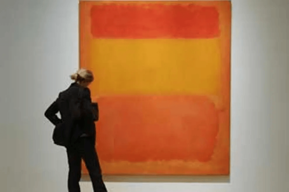
It is often said that there are no colour conflicts in nature. Famous interior designer David Hicks said that colours do not clash; they “vibrate”. He was referring to colours that are close, like pink and orange. Close colours seem to “vibrate” and create an attractive chromatic visual sensation when used in a room or, for example, in a painting of orange, red, and yellow colours by artist Mark Rothko. Many visitors who know India fondly remember the country’s vibrant colour combinations because of the vibration of colours. But regardless of nature, David Hicks, and the joy of Indian design, colours can clash for those who are not interior design experts, which leads us to our next tip.

“Orange, Red and Yellow”, oil painting by Mark Rothko, 1961

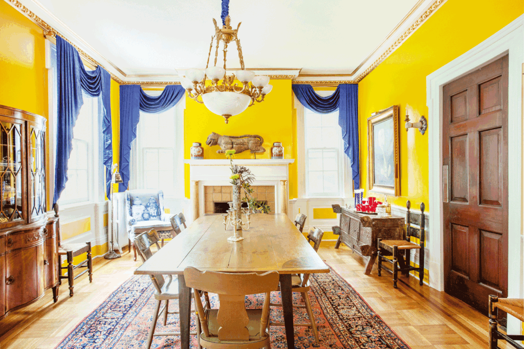
Interior design by Sasha Bikoff for Ed Schoenfeld and Elisa Herr, Garden State Revival House, Newark, New Jersey
3. Colour Intensity:
Pink and orange, or the explosion of colours and patterns in designs, require excellent skills and knowledge of colour theory. So, what can the rest of us do to mix colours and patterns? The answer is colour intensity and the rhythm of pattern on pattern (see tip 5). Colour intensity borrows the “rules” used in the colour analysis for clothes. Choose your preferred colours, as long as they are grouped into one of the six “intensity” categories: light, deep, bright, soft, warm, and relaxed.
4. Pattern – Opposites Attract
Now that you have your colour intensity guide, it’s time to think about patterns. It’s true – opposites attract. Florals look great with stripes and geometric figures, but mixing patterns without scale and rhythm can still be a minefield. There are two standard scales, larger and smaller or if you prefer, big and small. A large pattern is easily visible from across the room. A larger pattern with a smaller pattern will harmonize, and they don’t have to be opposites. For example, you can choose two different florals to make sure that the scales are distinctly different if these patterns are used on a large scale for upholstery.
The rule can be relaxed if you use them as scattered cushions. If you want to use only small-scale patterns (remembering, of course, that your anchor rug is a larger-scale pattern), it is easy to use several small to medium-scale patterns when they are grouped by colour intensity. Just remember to vary the types of patterns, for example, a small floral or boteh with a small-scale stripe or an ikat. Try to borrow pattern motifs from your rug to help you choose. For example, does your rug have a classic Tree of Life pattern? In that case, a small-scale geometric pattern plus a medium-scale pattern inspired by the rug’s landscape will create exciting and compatible contrasts. Don’t forget the invisible patterns; that is, solid colour upholstery, for example, with a tone-on-tone fabric pattern, which will help transition the gaze around the room and create a resting point and a visual boundary to avoid pattern confusion.
5. Pattern on Pattern: Rhythm
Rhythm in a room means repeating a pattern three to four times on various objects to create a cohesive design. For example, a geometric border on your rug can be chosen in fabric for sofa cushions and repeated throughout the room on a lampshade with a similar pattern. The patterns don’t have to be the same (better if they’re not), but they should be closely related within the general category of the pattern and the chosen colour intensity.
6. Final Tip
Our post is more about tips than rules, but there is a three-part rule we recommend
- Trust your instincts,
- Buy what you love, and
- Remember that a beautiful antique rug will provide the foundation for your design and will be the basis for the success of your home’s interior design.

Figalli Oriental Rugs
We do not sell rugs. We bring rare works of art to your home in the form of rugs.
Our services
You are Protected
Copyright © 2023 Figalli Oriental Rugs, All rights reserved. Desenvolvido por Agência DLB – Agência de Marketing Digital em Porto Alegre
